I did an internship 2020 at Zaplifyfor three months, at the time Zaplify was a rising start-up at a early stage developing a SaaS solution that helps with automated sales with prospecting and outreach through Linkedin, E-mail & other Social platforms.
Dozen of daily users were using Zaplify with no user control over their campaigns and its activities since no campaign management existed yet. They could only find prospects and launch campaigns.
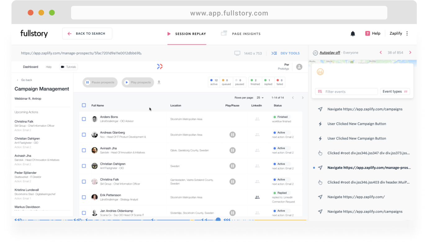
Through the design thinking process we created the very first management view that primary focused on displaying the users prospects & their status, the user has now the ability to pause, see upcoming actions and feel in control.

The purpose with this view was for the user to get informed about the prospects activity in their campaigns and to have the ability to manage the contact with the prospects.
We used a "business value vs. effort" matrix to prioritize user stories. This helped us set realistic expectations and focus on features that delivered the most impact for our users and the business.

Through this process, we identified the "must-have" features for the initial view, separating them from less critical functionalities that could be addressed later.
To achieve this, we transformed challenges into design opportunities by reframing them as "How Might We" questions.


Below are some of the wireframes I worked on trying to form a clearer picture of how the user would interact with the minimalistic overview. Laura our Design lead made the final decisions and interface touches.


During the process, we held 5 remote interviews to gather insight on users experience with CRM Software.
After implementing the view the team analyzed user behavior inside the platform to find and work on the biggest struggles and pain points.
Users don’t fully understand the hows, whats and flows of the MVP yet since it's in a very early development. They spend time mailing questions and waiting for answers and this also overwhelms the Start up.
We did this through the entire product - from searching prospects to creating a new campaign and launching it.

The focus was to encourage the user with different approaches. To learn by doing or by receiving information when they feel lost.


Three different pop-ups show up throughout the product when the user need to interact with a new view or larger task for the first time

Filling up empty states where the user doesn't have anything to display with text and a guidance link to encourage interaction.

We choose to divide the 30min long onboarding tutorial that existed to short ones and link them on the menu that would be available at all times.

We kept the tooltips at a minimum amount and focused on directing them to explore tutorials in case they later need help.


As this was my first time working with a real product, I learned something new every day! I got to use new analysis tools, collaborate with the team, become a good listener, understand what the product entails, and develop a passion for the work.
This UX case is now 4 years old, I have improved in documenting processes, decisions I take and matured as a designer.


